The pie lies
Why you should put the charity spending pie chart straight in the bin
By Caoileann Appleby - Sep 13 2021
#Charity folks. What's your opinion of 'pence in the pound' figures? (e.g. "for evey £1 raised, 80p goes towards [the cause]")
— Richard Berks (@DrRichardBerks) September 6, 2021
Essential? Helpful? Useful? Neccessary evil? Misleading? A distraction?
We responded on Twitter, but for posterity, here’s Ask Direct’s position: we don’t like them and we don’t generally advise our clients to use them. Why?
Firstly, it’s plain bad design (and at Ask Direct we like ugly design, but not bad, misleading design).
Because there’s only so much pie to go around. If you get a slice of pie, that’s one fewer slice for the rest of us, right? And consciously or not, that’s how we are training supporters to think about fundraising and “admin” costs by using a pie chart. If we spent on those things, then there’s less pie left for the cause, and that’s bad.
But that’s not how it works. Spending on admin – which could be anything from your wifi bill to paying an accountant – allows the work to go more smoothly, effectively, and safely. Sure, you could skip paying an accountant, but that isn’t going to make your organisation more effective or more responsible (just the opposite!).
As someone who used to assess the impact of charities, for funders, dangerous....
— Andrew Weston (@Andrew_G_Weston) September 6, 2021
The charities that got obsessed with a good pence in the pound figure tended to be most vulnerable to, misuse or poor use of funds, as they cut all forms of oversight or checks to keep costs down
And spending on fundraising doesn’t take away the pie – it actually grows the pie. Spending on fundraising is an investment; it makes money! It’s a slice of pie that doubles or triples or quadruples its own size quite quickly (in the case of legacies, it’s much, much more than that, although it happens more slowly).
So low fundraising spend doesn’t mean more pie for “the cause”, it means less pie overall.
Bragging about how your fundraising cost percentage is really low is like trying to sell pies by bragging about how cheaply you buy your flour and butter. It’s not only gross, it will also put any sensible customer off buying from you.
When you tell people how little you spend on fundraising you are essentially telling them how little you care about getting other people engaged in what you believe to be incredibly valuable work.
— danpallotta (@danpallotta) May 20, 2021
Pie charts like these also rest on a number of assumptions:
- That supporters care mostly about what their donations are spent on (not how effectively this is done)
- That admin/overhead/fundraising costs are categorised in the same way between different charities.
- That there is a broadly-applicable % of admin/overhead/fundraising costs that are acceptable (and that donors know what that is)
None of these assumptions are true.
Supporters care more about other things
When we talk to supporters as part of our research – supporters of many different charities, of all ages and circumstances – they don’t talk about pie charts. They do care that the charity is doing what they say they’re doing, of course. CEO salaries as a concern does come up – but that’s not shown in any pie chart I’ve ever seen.
Higher-value donors are different in that regard – they are much more likely to talk in detail about how the charity is run and what they’ve seen in the annual report. But a simple pie chart wouldn’t satisfy these donors anyway: they want the full Statement of Financial Accounts.
And all donors care about dogs saved, research done, patients cared for, and changing the world much more than they care about costs.
Costs are categorised differently for different charities
People often think that salaries are “admin” (this illusion comes from the same mindset that assumes volunteering is the most virtuous form of charity work).
What if your charity runs a helpline, staffed by qualified medical professionals? They need to be paid – but their salaries are directly related to the cause (the same goes for any expert, by the way, including fundraisers!). Are they cause-related costs, or admin? Similarly, if your charity gives research grants, that seems cause-related – but a proportion of that grant pays the researchers (and rightly so).
It’s up to each charity to decide how they categorise things, so comparing charities’ costs side-by-side in a pie chart doesn’t actually tell you anything useful. You’ll probably need to read the annual report. So why not start there in the first place?
There is no universal standard
Often you’ll see or hear advice that 90% of income should be spent on the cause (i.e.: “overhead” should be 10% or below). Whatever the figure is, the pie chart/cents in the euro/pence in the pound format enourages donors to think that a lower percentage indicates a better, less wasteful organisation.
So let's compare these two pie charts: which is better?
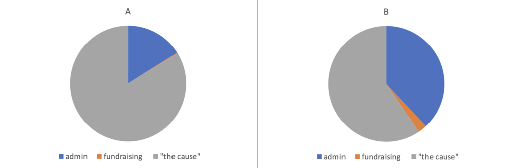
Are you sure?
Pie Chart A has been created from the figures in ASN’s annual report in 2012. At that time, it was an all-volunteer organisation (to be clear: I started volunteering as a fundraiser and board member in 2013 and am still a volunteer fundraiser for ASN). There was no paid staff position, so ‘admin’ costs were low, and barely anything was spent on fundraising. That means a great-looking pie chart, but it also meant an organisation that was surviving on £18k a year and only heard from ~350 clients.
Pie Chart B is from 2014. ASN ran a crowdfunding campaign to pay a part-time staff salary (counted here under ‘admin’) and therefore spent more on fundraising. ASN's income also increased to over £50k and they were able to help ~550 clients. So the second organisation is spending more on admin and fundraising, and is also raising more money and reaching more people.
But the pie chart looks “worse”. The pie lies!
Fast-forward to 2020: ASN has added more staff positions (as well as more volunteers). They have increased fundraising spend and income has grown to over £360,000 annually; with more supporters than ever. Most importantly, ASN heard from over 780 clients in 2020, gave bigger grants to those clients, and part-funded another helpline that heard from over 5,000 people. None of which would have happened without increasing spend on salaries, operational costs, and fundraising.
Similarly, an organisation in its early stages will likely need to spend more on admin, marketing and fundraising than one that’s been going for over a century and already has a strong brand presence in the market.
There are ways of comparing charities that are more detailed and useful (see this example from Charity Intelligence Canada). In Ireland, we have the Triple Lock Standards which charities can use as a quick visual way to indicate that they are operating responsibly. There are alternative ways of visualising nonprofit spend and how it’s divided. But a simple spending pie chart harms more than it helps.
The pie chart isn’t just an oversimplification of a snapshot in time – it’s actively misleading in several different ways. It’s also not what your supporters want. So please – let’s bin it.
If you want to find out:
- How your supporters feel and what they really want
- How to build loyalty with your supporters
- How to demonstrate your organisation’s effectiveness
- How to raise more through legacy giving
Talk to us.
Caoileann Appleby @Qaoileann
